Colour Theory in a Cottage Home
Why warm undertones and mustard work so well with age and light.
Warm colours weren’t always my first instinct. I spent my early decorating years enthusiastically painting every room a different shade—salmon, mauve, khaki… I loved colour, but I hadn’t yet learned restraint. What I’ve come to realise—through years of mismatched walls and many paint tins—is that older homes don’t just tolerate warm undertones, they thrive in them. Especially our home.
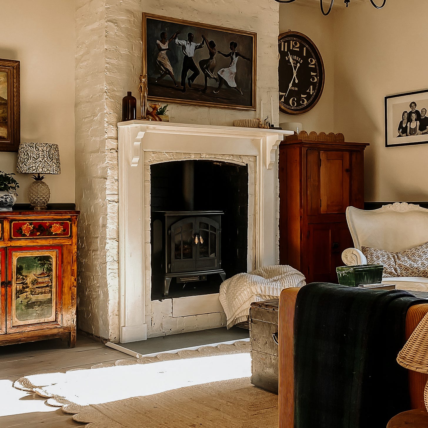
At Blackbird Cottage, I wanted the palette to feel gentle but full of life. And for that reason, I steered clear of the crisper often cooler whites that are fashionable in Australia. The colours we’ve chosen—warm white, mustard yellow, and deep earthy green—are drawn from the Australian landscape outside our windows, and woven through the home in different ways. They create cohesion without sameness, flow without flatness.
“An old cottage whispers back when you choose warm colours. They feel like they’ve always been there.”
Warm undertones do something special with light. Cool whites and greys, while beautiful in modern builds, can feel cold or washed out in rooms with aged timber, shadowed corners, and textured walls. In contrast, warm whites respond to the imperfections of old plaster and the patina of time with a kind of softness that feels lived-in rather than stark. The afternoon light moves across our warm white walls like honey, and in the evenings, everything glows under lamplight.
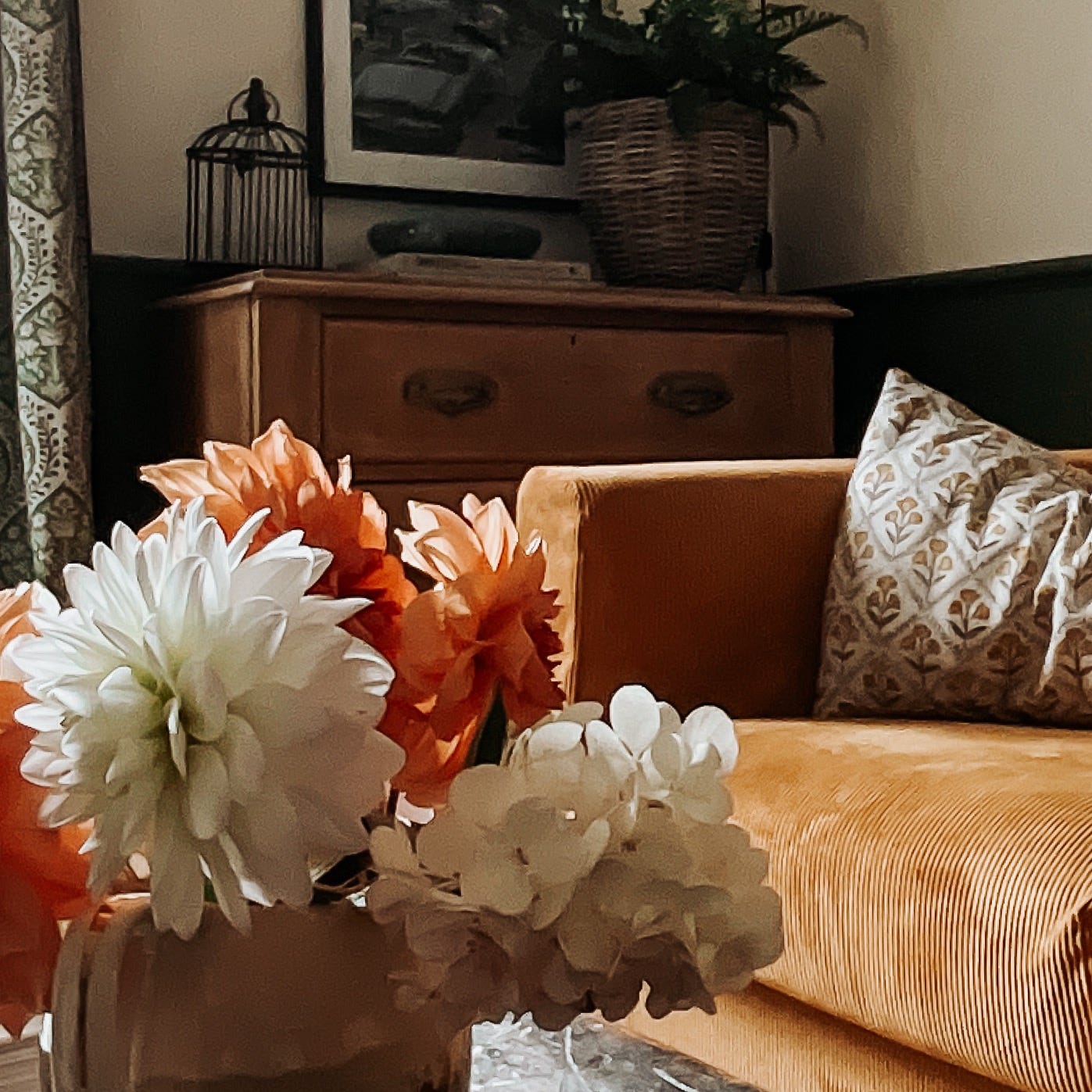
Then there’s mustard—perhaps my boldest choice. Our sofa might not be everyone’s neutral, but it brings the room to life. It anchors the space, adds a pop of cheer on rainy days, and plays beautifully with the golden tones in the timber furniture and gilt-framed art. It’s not loud, but it holds its own, like a well-worn book on a shelf.
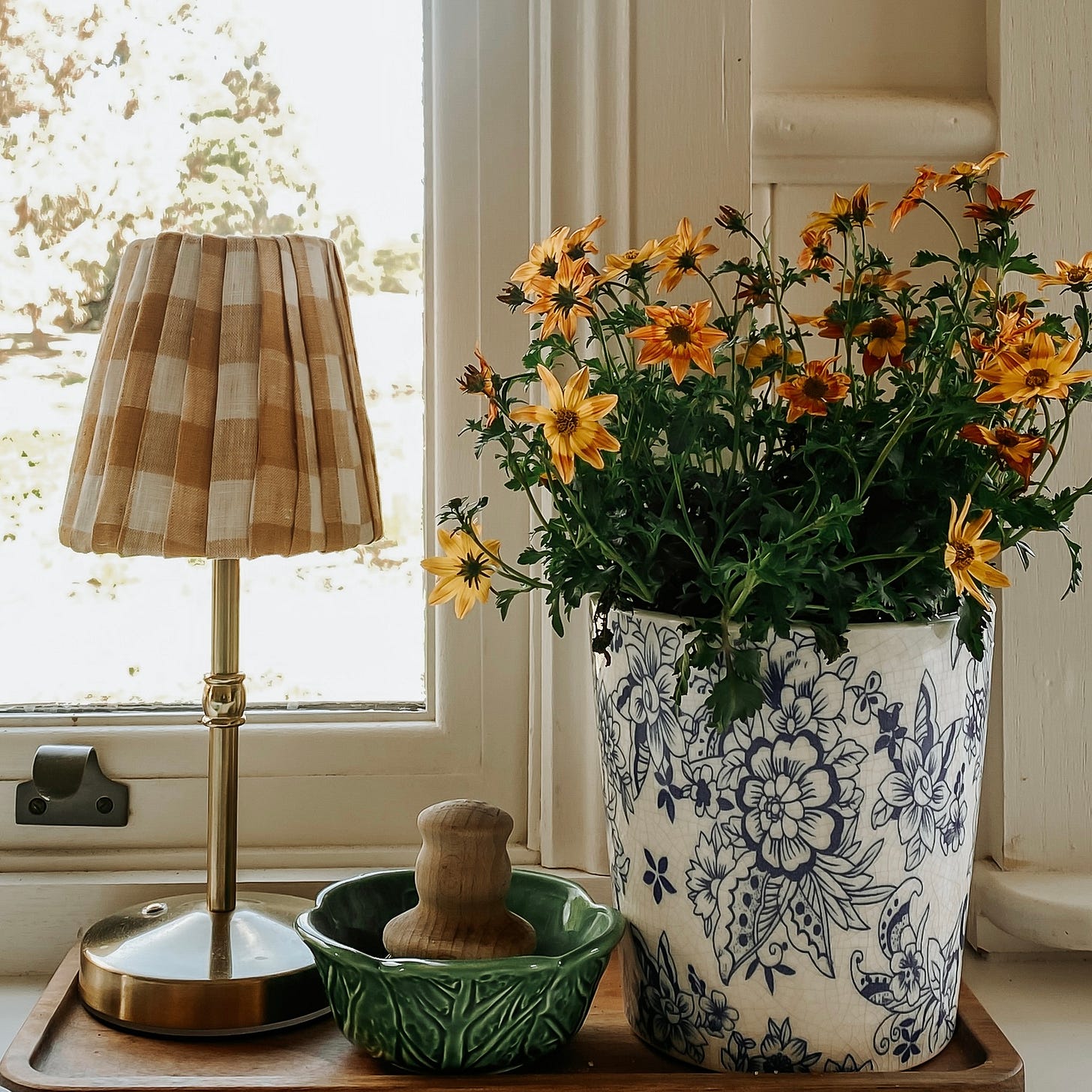
I’ve also leaned on green—never a favourite in my younger years, but one I’ve come to appreciate for its grounding effect. Paired with soft florals, checks, and natural textures like linen and jute, it adds just the right amount of contrast to keep the space feeling collected, not chaotic.
“In a small home, the palette doesn’t need to be boring—it just needs to be in conversation with itself.”
I’ve stuck to a whole-house colour scheme not to play it safe, but to make life easier. Furniture and accessories move freely from room to room, and everything feels like it belongs. The eye rests, even if you don’t know why. That’s the beauty of cohesion.
And while I might change my mind (as I often do), the warmth in this home isn’t going anywhere. It’s built in, layered in, painted in. And every time the light hits just right, I’m reminded I chose well.
What colours make your house feel most like home? I’d love to hear how you’ve used warmth—or taken risks—in your own decorating journey.


I love both your aesthetic and your turn of phrase describing your home! I use a similar approach to our home. We live on the coast in the PNW in a home with lots of windows. Like you I have used a slightly warm white throughout the house on the walls. The warmth comes from Amish made black walnut furniture, rich umber, linen, and accents of dusky blue-green. I don’t normally use blues but this house with its location and light, it’s just lovely.
I have painted my 1920s house in a light magnolia. With a lack of natural light due to lack of windows ( particularly in winter), i wanted to highlight the12ft ceilings.
I intend to pay homage to the era with greens and other earthy tones in my furnishings. The baltic pine floorboards will eventually be sanded & sealed.
The original green paint darkened the rooms and I was sad painting over it, but needed a blank canvas for my turn in my grandparents' house.